css 形狀_CSS形狀簡介
css 形狀
Until the introduction of CSS Shapes, it was nearly impossible to design a magazine-esque layout with free flowing text for the web. On the contrary, web design layouts have traditionally been shaped with grids, boxes, and straight lines.
在引入CSS Shapes之前,幾乎不可能設計出具有雜志風格的布局并為網絡自由流動文本。 相反,Web設計布局傳統上是用網格,盒子和直線來成形的。
CSS Shapes allow us to define geometric shapes that text can flow around. These shapes can be circles, ellipses, simple or complex polygons, and even images and gradients. A few practical design applications of Shapes might be displaying circular text around a circular avatar, displaying text over the simple part of a full-width background image, and displaying text flowing around drop caps in an article.
CSS Shapes允許我們定義文本可以圍繞的幾何形狀。 這些形狀可以是圓形,橢圓形,簡單或復雜的多邊形,甚至圖像和漸變。 Shapes的一些實際設計應用可能是在圓形化身周圍顯示圓形文本,在全角背景圖像的簡單部分上顯示文本,以及在文章中的首字下沉顯示文本。
Now that CSS Shapes have gained widespread support across modern browsers, it’s worth taking a look into the flexibility and functionality they provide to see if they might make sense in your next design project.
既然CSS Shapes已在現代瀏覽器中獲得了廣泛的支持,就值得一看它們提供的靈活性和功能,以了解在您的下一個設計項目中是否有意義。
首先看一下CSS Shapes (First Look at CSS Shapes)
The current implementation of CSS Shapes is CSS Shapes Module Level 1, which mostly revolves around the shape-outside property. shape-outside defines a shape that text can flow around.
CSS Shapes的當前實現是CSS Shapes Module Level 1 ,它主要圍繞shape-outside屬性。 shape-outside定義了文本可以圍繞的形狀。
Considering there is a shape-outside property, you might assume there is a corresponding shape-inside property that would contain text within a shape. A shape-inside property might become a reality in the future, but it is currently a draft in CSS Shapes Module Level 2, and is not implemented by any browser.
考慮到有一個shape-outside屬性,您可以假設存在一個相應的shape-inside屬性,該屬性將在形狀內包含文本。 shape-inside屬性將來可能會成為現實,但目前是CSS Shapes Module Level 2中的草稿,并且沒有任何瀏覽器實現。
In this article, we’re going to demonstrate how to use the <basic-shape> data type and set it with shape function values, as well as setting a shape using a semi-transparent URL or gradient.
在本文中,我們將演示如何使用<basic-shape>數據類型并將其設置為形狀函數值,以及如何使用半透明的URL或漸變來設置形狀。
基本形狀功能 (Basic Shape Functions)
We can define all sorts of Basic Shapes in CSS by applying the following function values to the shape-outside property:
通過將以下函數值應用于shape-outside屬性,我們可以在CSS中定義各種基本形狀:
circle()circle()ellipse()ellipse()inset()inset()polygon()polygon()
In order to apply the shape-outside property to an element, the element must be floated, and have a defined height and width. Let’s go through each of the four basic shapes and demonstrate how they can be used.
為了將shape-outside屬性應用到元素,元素必須是浮動的,并且具有定義的高度和寬度。 讓我們仔細研究這四個基本形狀,并演示如何使用它們。
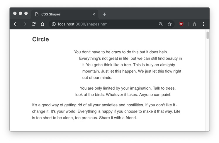
圈 (Circle)
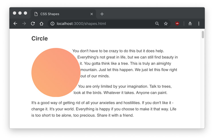
We’ll start with the circle() function. Imagine a situation in which we have a circular avatar of an author that we want to float left, and we want the author’s description text to flow around it. Simply using a border-radius: 50% on the avatar element won’t be enough to get the text to make a circular shape; the text will still treat the avatar as a rectangular element.
我們將從circle()函數開始。 想象一下這樣一種情況,我們有一個作者的圓形化身想要向左浮動,并且我們希望作者的描述文字在其周圍流動。 簡單地使用border-radius: 50%化身元素上的border-radius: 50%不足以使文本成為圓形; 文本仍將化身視為矩形元素。
With the circle shape, we can demonstrate how text can flow around a circle.
通過圓形,我們可以演示文本如何圍繞圓形流動。
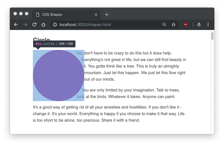
We’ll start by creating a circle class on a regular div, and making some paragraphs. (I used Bob Ross quotes as Lorem Ipsum text.)
我們將從在常規div上創建一個circle類開始,然后制作一些段落。 (我使用Bob Ross引號作為Lorem Ipsum文本。)
<div class="circle"></div>
<p>Example text...</p>
In our circle class, we float the element left, give it an equal height and width, and set the shape-outside to circle().
在我們的circle類中,我們將元素向左浮動,使其height和width相等,并將shape-outside設置為circle() 。
.circle {
  float: left;
  height: 200px;
  width: 200px;
  shape-outside: circle();
}
If we view the page, it will look like this.
如果我們查看該頁面,它將看起來像這樣。
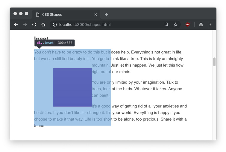
As you can see, the text flows around the circle shape, but we don’t actually see any shape. Hovering over the element in Developer Tools will show us the actual shape that is being set.
如您所見,文本圍繞圓形流動,但實際上看不到任何形狀。 將鼠標懸停在Developer Tools中的元素上將向我們展示所設置的實際形狀。
At this point, you might assume that you can set a background color or image to the element, and you’ll see the shape. Let’s try that out.
此時,您可能假設可以為元素設置background顏色或圖像,然后您將看到形狀。 讓我們嘗試一下。
.circle {
  float: left;
  height: 200px;
  width: 200px;
  shape-outside: circle();
  background: linear-gradient(to top right, #FDB171, #FD987D);
}
Frustratingly, setting a background to the circle just gives us a rectangle, the very thing we’ve been trying to avoid.
令人沮喪的是,將background設置為circle只會給我們一個矩形,這正是我們一直在努力避免的事情。

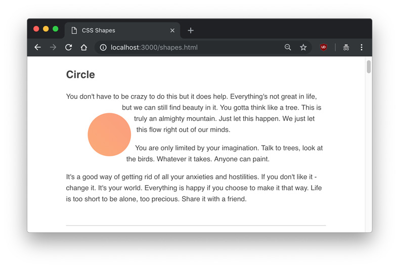
We can clearly see the text flowing around it, yet the element itself doesn’t have a shape. If we want to actually display our shape functions, we’ll have to use the clip-path property. clip-path takes many of the same values as shape-outside, so we can give it the same circle() value.
我們可以清楚地看到周圍有文字,但是元素本身沒有形狀。 如果要實際顯示形狀函數,則必須使用clip-path屬性。 clip-path具有許多與shape-outside相同的值,因此我們可以為其賦予相同的circle()值。
.circle {
  float: left;
  height: 200px;
  width: 200px;
  shape-outside: circle();
  clip-path: circle();
  background: linear-gradient(to top right, #FDB171, #FD987D);
}
For the rest of the article, I’ll use
clip-pathto help us identify the shapes.在本文的其余部分,我將使用
clip-path來幫助我們識別形狀。
The circle() function takes an optional parameter of radius. In our case, the default radius (r) is 50%, or 100px. Using circle(50%) or circle(100px) would produce the same result as what we’ve already done. You might notice the text is right up against the shape. We can use the shape-margin property to add a margin to the shape, which can be set in px, em, %, and any other standard CSS unit of measurement.
circle()函數采用半徑可選參數。 在我們的示例中,默認半徑( r )為50%或100px 。 使用circle(50%)或circle(100px)會產生與我們已經完成的結果相同的結果。 您可能會注意到文本正好與形狀對齊。 我們可以使用shape-margin屬性為shape-margin添加邊距,可以在px , em , %和任何其他標準CSS度量單位中進行設置。
.circle {
  float: left;
  height: 200px;
  width: 200px;
  shape-outside: circle(25%);
  shape-margin: 1rem;
  clip-path: circle(25%);
  background: linear-gradient(to top right, #FDB171, #FD987D);
}
Here is an example of a 25% circle() radius with a shape-margin applied.
這是一個半徑為25% circle()應用了shape-margin circle()的示例。
In addition to the radius, a shape function can take a position using at. The default position is the center of the circle, so circle() would explicitly be written as circle(50% at 50% 50%) or circle(100px at 100px 100px), with the two values being the horizontal and vertical positions, respectively.
除了半徑,形狀函數可以使用采取的位置at 。 默認位置是圓的中心,因此circle()將顯式寫為circle(50% at 50% 50%)或circle(100px at 100px 100px) ,兩個值分別是水平位置和垂直位置。
To make it obvious how the positioning works, we could set the horizontal position value to 0 to make a perfect semi-circle.
為了使定位很明顯,我們可以將水平位置值設置為0以形成完美的半圓。
circle(50% at 0 50%);This coordinate positioning system is known as the reference box.
該坐標定位系統稱為參考框。

Later on, we’ll learn how to use an image instead of a shape or gradient. For now, we’ll move on the to the next shape function.
稍后,我們將學習如何使用圖像而不是形狀或漸變。 現在,我們將移至下一個形狀函數。
橢圓 (Ellipse)
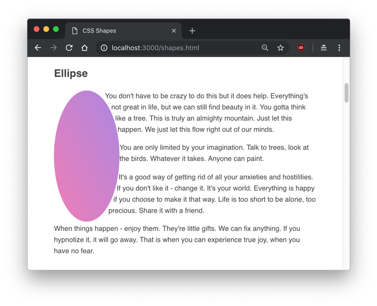
Similar to the circle() function is the ellipse(), which creates an oval. To demonstrate, we can create an ellipse element and class.
與circle()函數類似的是ellipse() ,它創建一個橢圓形。 為了演示,我們可以創建一個ellipse元素和類。
<div class="ellipse"></div>
<p>Example text...</p>
.ellipse {
float: left;
shape-outside: ellipse();
clip-path: ellipse();
width: 150px;
height: 300px;
background: linear-gradient(to top right, #F17BB7, #AD84E3);
}This time, we set a different height and width to make a vertically elongated oval.
這次,我們設置了不同的height和width以制作垂直拉長的橢圓形。
The difference between an ellipse() and a circle() is that an ellipse has two radii – rx and ry, or the X-axis radius and Y-axis radius. Therefore, the above example can also be written as:
ellipse()和circle()之間的區別在于,橢圓具有兩個半徑– r x和r y ,即X軸半徑和Y軸半徑。 因此,以上示例也可以寫成:
ellipse(75px 150px);The position parameters are the same for circles and ellipses. The radii, in addition to being a unit of measurement, also include the options of farthest-side and closest-side.
圓和橢圓的位置參數相同。 半徑除了作為度量單位外,還包括farthest-side和closest-side的選項。
closest-side refers to the length from the center to closest side of the reference box, and conversely, farthest-side refers to the length from the center to the farthest side of the reference box. This means that these two values have no effect if a position other than default isn’t set.
closest-side是指從參考框的中心到最近側的長度,相反, farthest-side是指從參考框的中心到最遠側面的長度。 這意味著,如果未設置默認位置以外的位置,則這兩個值無效。
Here is a demonstration of the difference of flipping closest-side and farthest-side on an ellipse() with a 25% offset on the X and Y axes.
這展示了在ellipse()上翻轉closest-side和farthest-side遠側的差異,在X和Y軸上偏移25% 。
ellipse(farthest-side closest-side at 25% 25%)
ellipse(farthest-side closest-side at 25% 25%)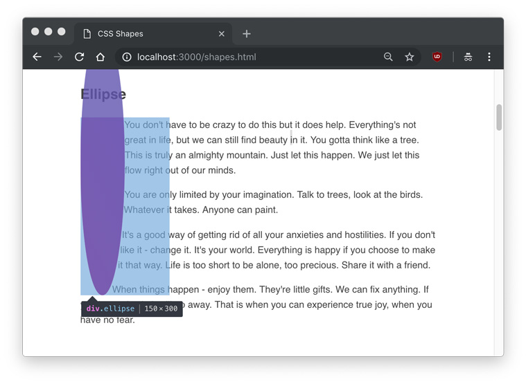
插圖 (Inset)
So far we’ve been only been dealing with round shapes, but we can define inset rectangles with the inset() function.
到目前為止,我們只涉及圓形,但是我們可以使用inset()函數定義插入矩形。
<div class="inset"></div>
<p>Example text...</p>
.inset {
float: left;
shape-outside: inset(75px);
clip-path: inset(75px);
width: 300px;
height: 300px;
background: linear-gradient(#58C2ED, #1B85DC);
}In this example, we’ll create a 300px by 300px rectangle, and inset it by 75px on all sides. This will leave us with a 150px by 150px with 75px of space around it.
在此示例中,我們將創建一個300px x 300px矩形,并在所有側面上將其插入75px 。 這將使我們剩下150px x 150px ,周圍有75px的空間。
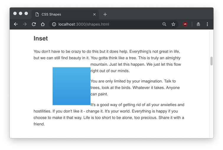
We can see that the rectangle is inset, and the text ignores the inset area.
我們可以看到矩形是插入的,并且文本忽略了插入區域。
An inset() shape can also take a border-radius with the round parameter, and the text will respect the rounded corners, such as this example with a 25px on all sides and 75px rounding.
inset()形狀也可以使用round參數作為border-radius ,并且文本將遵守圓角,例如本示例中的所有邊均為25px ,四舍五入為75px 。
inset(25px round 75px)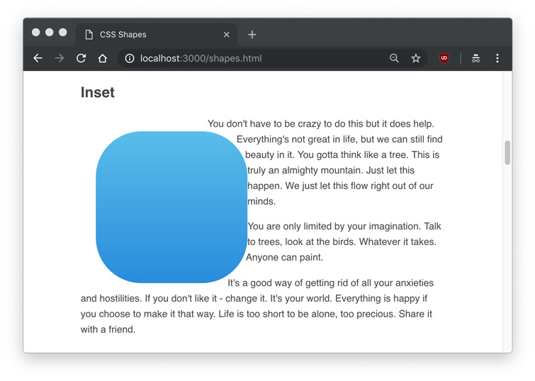
Like padding or margin shorthand, the inset value will accept top right bottom left values in clockwise order (inset(25px 25px 25px 25px)), and only using a single value will make all four sides the same (inset(25px)).
像padding或margin的簡寫,插圖價值將接受top right bottom left順時針順序值( inset(25px 25px 25px 25px) ),并且只使用單一值將使所有四邊相同( inset(25px) )。
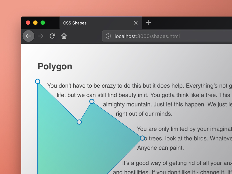
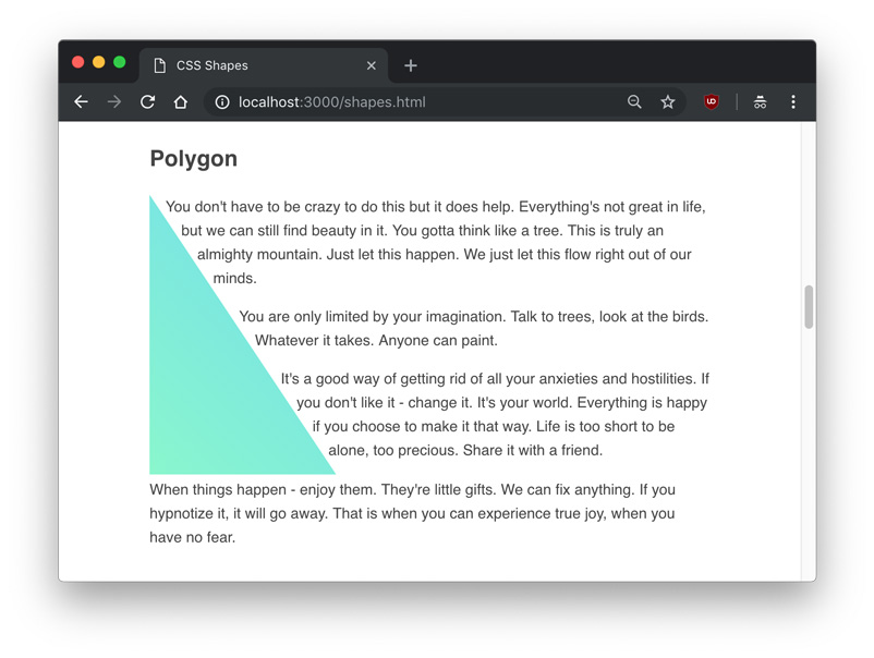
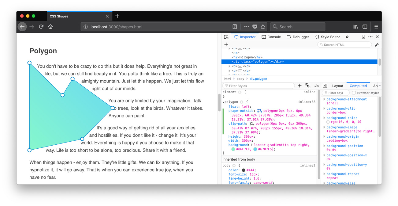
多邊形 (Polygon)
The most interesting and flexible of the shape functions is the polygon(), which can take an array of x and y points to make any complex shape. Each item in the array represents xi yi, and would be written as polygon(x1 y1, x2 y2, x3 y3...) and so on.
形狀函數中最有趣和最靈活的是polygon() ,它可以使用x和y點的數組來制作任何復雜的形狀。 數組中的每一項都代表x i y i ,并將被寫為polygon(x1 y1, x2 y2, x3 y3...)等。
The fewest amount of point sets we can apply to a polygon is three, which will create a triangle.
我們可以應用于多邊形的最少數量的點集是三個,這將創建一個三角形。
<div class="polygon"></div>
<p>Example text...</p>
.polygon {
float: left;
shape-outside: polygon(0 0, 0 300px, 200px 300px);
clip-path: polygon(0 0, 0 300px, 200px 300px);
height: 300px;
width: 300px;
background: linear-gradient(to top right, #86F7CC, #67D7F5);
}In this shape, the first point is 0 0, the top left most point in the div. The second point is 0 300px, which is the bottom left most point in the div. The third and final point is 200px 300px, which is 2/3rd across the X axis and still at the bottom. The resulting shape looks like this:
在此形狀中,第一個點是0 0 ,即div最左上的點。 第二個點是0 300px ,它是div最左下的點。 第三點也是最后一點是200px 300px ,它是X軸的2/3,仍在底部。 產生的形狀如下所示:
An interesting usage of the polygon() shape function is that text content can flow between two or more shapes. Since the polygon() shape is so flexible and dynamic, this is one of the biggest opportunities to make truly unique, magazine-esque layouts. In this example, we’ll put some text between two polygon shapes.
polygon()形狀函數的一個有趣用法是,文本內容可以在兩個或更多形狀之間流動。 由于polygon()形狀是如此靈活和動態,因此這是制作真正獨特的,雜志式布局的最大機會之一。 在此示例中,我們將在兩個多邊形之間放置一些文本。
<div class="left"></div>
<div class="right"></div>
<p>Example text...</p>
.left {
float: left;
shape-outside: polygon(0 0, 0 300px, 200px 300px);
clip-path: polygon(0 0, 0 300px, 200px 300px);
background: linear-gradient(to top right, #67D7F5, #86F7CC);
height: 300px;
width: 300px;
}
.right {
float: right;
shape-outside: polygon(200px 300px, 300px 300px, 300px 0, 0 0);
clip-path: polygon(200px 300px, 300px 300px, 300px 0, 0 0);
background: linear-gradient(to bottom left, #67D7F5, #86F7CC);
height: 300px;
width: 300px;
}
Obviously, it would be very difficult to try to create your own complex shapes manually. Fortunately, there are several tools you can use to create polygons. Firefox has a built in editor for shapes, which you can use by clicking on the polygon shape in the Inspector.
顯然,嘗試手動創建自己的復雜形狀非常困難。 幸運的是,可以使用多種工具來創建多邊形。 Firefox具有一個內置的形狀編輯器,您可以通過在檢查器中單擊多邊形形狀來使用它。
And for now, Chrome has some extensions you can use, such as CSS Shapes Editor.
現在,Chrome具有一些可以使用的擴展程序,例如CSS Shapes Editor 。
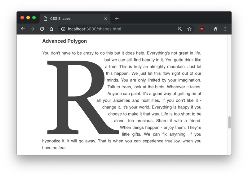
Polygons can be used to cut out shapes around images or other elements. In another example, we can create a drop cap by drawing a polygon around a large letter.
多邊形可用于剪切圖像或其他元素周圍的形狀。 在另一個示例中,我們可以通過在大字母周圍繪制多邊形來創建首字下沉。
<div class="letter">R</div>
<p>Example text...</p>
.letter {
float: left;
font-size: 400px;
font-family: Georgia;
line-height: .8;
margin-top: 20px;
margin-right: 20px;
shape-outside: polygon(5px 14px, 233px 20px, 246px 133px, 189px 167px, 308px 304px, 0px 306px) content-box;
clip-path: polygon(5px 14px, 233px 20px, 246px 133px, 189px 167px, 308px 304px, 0px 306px);
}
網址 (URLs)
An exciting feature of CSS Shapes is that you don’t always have to explicitly define the shape with a shape function; you can also use a url of a semi-transparent image to define a shape, and the text will automatically flow around it.
CSS Shapes的一項令人興奮的功能是,您不必總是使用shape函數來明確定義形狀。 您還可以使用半透明圖像的url定義形狀,文本將自動圍繞該形狀流動。
It’s important to note that the image used must be CORS compatible, otherwise you’ll get an error like one below.
重要的是要注意,所使用的圖像必須與CORS兼容,否則會出現類似以下的錯誤。
Access to image at 'file:///users/tania/star.png' from origin 'null'
has been blocked by CORS policy: The response is invalid.
Serving an image on a server from the same server will ensure you don’t get that error.
從同一服務器在服務器上提供圖像將確保您不會出現該錯誤。
Unlike in the other examples, we’re going to use an img tag instead of a div. This time the CSS is simple – just put the url() into the shape-outside property, like you would with background-image.
與其他示例不同,我們將使用img標簽而不是div 。 這次CSS很簡單–只需將url()放到shape-outside屬性中,就像使用background-image 。
<img src="./star.png" class="star">
<p>Example text...</p>
.star {
float: left;
height: 350px;
width: 350px;
shape-outside: url('./star.png')
}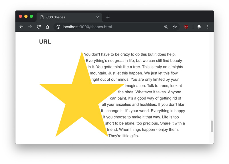
Since the image I used was a star with a transparent background, the text knew which areas were transparent and which were opaque, and aligned itself accordingly.
由于我使用的圖像是具有透明背景的星星,因此文本知道哪些區域是透明的,哪些區域是不透明的,并相應地對齊了它們。
漸變色 (Gradients)
Finally, a gradient can also be used as a shape. Gradients are the same as images, and just like the image example we used above, the text will know to flow around the transparent part.
最后,漸變也可以用作形狀。 漸變與圖像相同,就像我們上面使用的圖像示例一樣,文本將知道在透明部分周圍流動。
We’re going to use one new property with gradients – the shape-image-threshold. The shape-image-threshold defines the alpha channel threshold of a shape, or what percent of the image can be transparent vs. opaque.
我們將使用一個帶有漸變的新屬性– shape-image-threshold 。 shape-image-threshold定義shape-image-threshold的Alpha通道閾值,或者圖像的透明百分比與不透明百分比。
I’m going to make a gradient example that’s a 50%/50% split of a color and transparent, and set a shape-image-threshold of .5, meaning all pixels that are over 50% opaque should be considered part of the image.
我將創建一個漸變示例,該示例將顏色和透明分為50%/ 50%,并將shape-image-threshold為.5 ,這意味著不透明度超過50%的所有像素都應視為圖片。
<div class="gradient"></div>
<p>Example text...</p>
.gradient {
float: left;
height: 300px;
width: 100%;
background: linear-gradient(to bottom right, #86F7CC, transparent);
shape-outside: linear-gradient(to bottom right, #86F7CC, transparent);
shape-image-threshold: .5;
}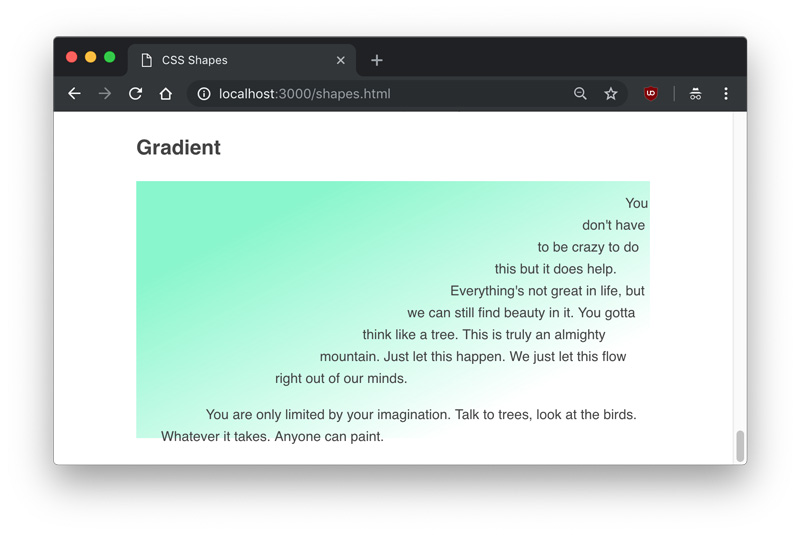
We can see the gradient is perfectly split diagonally at the center of opaque and transparent.
我們可以看到漸變在不透明和透明的中心完全對角地分開。
結論 (Conclusion)
In this article, we learned about shape-outside, shape-margin, and shape-image-threshold, three properties of CSS Shapes. We also learned how to use the function values to create circles, ellipses, inset rectangles, and complex polygons that text can flow around, and demonstrated how shapes can detect the transparent parts of images and gradients.
在本文中,我們了解了CSS Shapes的三個屬性shape-outside , shape-margin和shape-image-threshold 。 我們還學習了如何使用函數值創建文本可以圍繞的圓形,橢圓形,插入矩形和復雜多邊形,并演示了形狀如何檢測圖像和漸變的透明部分。
You can find all examples of this article in the following demo. You can also download the source files.
您可以在以下演示中找到本文的所有示例。 您也可以下載源文件。
翻譯自: https://tympanus.net/codrops/2018/11/29/an-introduction-to-css-shapes/
css 形狀
智能推薦

requests實現全自動PPT模板
http://www.1ppt.com/moban/ 可以免費的下載PPT模板,當然如果要人工一個個下,還是挺麻煩的,我們可以利用requests輕松下載 訪問這個主頁,我們可以看到下面的樣式 點每一個PPT模板的圖片,我們可以進入到詳細的信息頁面,翻到下面,我們可以看到對應的下載地址 點擊這個下載的按鈕,我們便可以下載對應的PPT壓縮包 那我們就開始做吧 首先,查看網頁的源代碼,我們可以看到每一...
Linux C系統編程-線程互斥鎖(四)
互斥鎖 互斥鎖也是屬于線程之間處理同步互斥方式,有上鎖/解鎖兩種狀態。 互斥鎖函數接口 1)初始化互斥鎖 pthread_mutex_init() man 3 pthread_mutex_init (找不到的情況下首先 sudo apt-get install glibc-doc sudo apt-get install manpages-posix-dev) 動態初始化 int pthread_...
統計學習方法 - 樸素貝葉斯
引入問題:一機器在良好狀態生產合格產品幾率是 90%,在故障狀態生產合格產品幾率是 30%,機器良好的概率是 75%。若一日第一件產品是合格品,那么此日機器良好的概率是多少。 貝葉斯模型 生成模型與判別模型 判別模型,即要判斷這個東西到底是哪一類,也就是要求y,那就用給定的x去預測。 生成模型,是要生成一個模型,那就是誰根據什么生成了模型,誰就是類別y,根據的內容就是x 以上述例子,判斷一個生產出...
styled-components —— React 中的 CSS 最佳實踐
https://zhuanlan.zhihu.com/p/29344146 Styled-components 是目前 React 樣式方案中最受關注的一種,它既具備了 css-in-js 的模塊化與參數化優點,又完全使用CSS的書寫習慣,不會引起額外的學習成本。本文是 styled-components 作者之一 Max Stoiber 所寫,首先總結了前端組件化樣式中的最佳實踐原則,然后在此基...
猜你喜歡

19.vue中封裝echarts組件
19.vue中封裝echarts組件 1.效果圖 2.echarts組件 3.使用組件 按照組件格式整理好數據格式 傳入組件 home.vue 4.接口返回數據格式...
【一只蒟蒻的刷題歷程】【藍橋杯】歷屆試題 九宮重排 (八數碼問題:BFS+集合set)
資源限制 時間限制:1.0s 內存限制:256.0MB 問題描述 如下面第一個圖的九宮格中,放著 1~8 的數字卡片,還有一個格子空著。與空格子相鄰的格子中的卡片可以移動到空格中。經過若干次移動,可以形成第二個圖所示的局面。 我們把第一個圖的局面記為:12345678. 把第二個圖的局面記為:123.46758 顯然是按從上到下,從左到右的順序記錄數字,空格記為句點。 本題目的任務是已知九宮的初態...

dataV組件容器寬高發生變化后,組件不會自適應解決方法
項目中需要大屏幕數據展示,于是使用了dataV組件,但是使用是發現拖動瀏覽器邊框,dataV組件顯示異常,如圖: 于是查了官網,官網的解釋如下: 于是按照官網的意思編寫代碼: 于是可以自適應了...