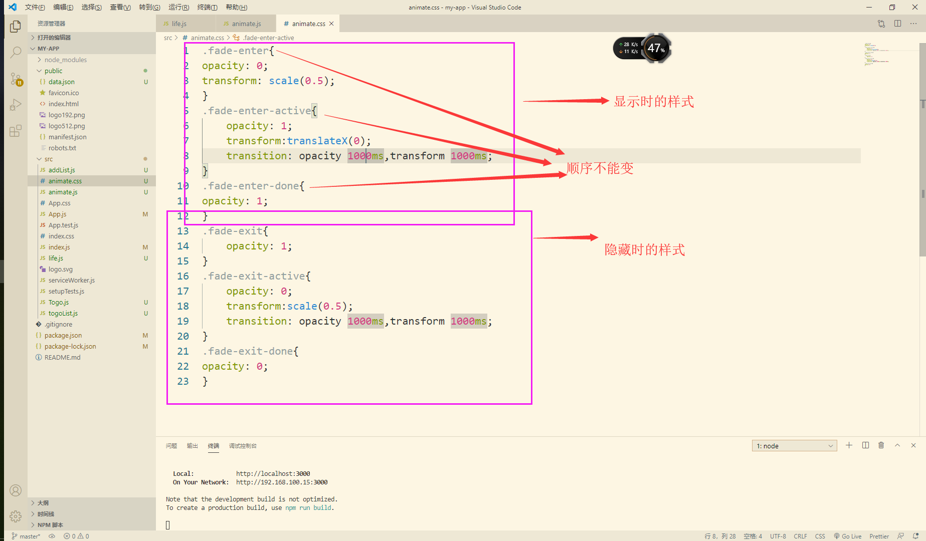
react native學習筆記29——動畫篇 Animated高級動畫
標簽: react-native
1.前言
上一節我們學習了全局的布局動畫api——LayoutAnimation,體驗到其流暢柔和的動畫效果,但有時我們需要實現一些更精細化的動畫,或者完成一些組合動畫,這時我們可以使用React Native提供的另一個高級動畫api——Animated。
Animated使得我們可以非常容易地實現各種各樣的動畫和交互方式,并且具備極高的性能。Animated旨在以聲明的形式來定義動畫的輸入與輸出,通常只需要關注設置動畫的開始和結束即可,在其中建立一個可配置的變化函數,然后使用start/stop方法來控制動畫按順序執行。
下面通過一個簡單的淡入動畫逐步展開介紹Animated的具體使用,還是基于上一節的LayoutAnimation的使用實例修改。
import React, { Component } from 'react';
import {
    StyleSheet,
    Text,
    View,
    TouchableOpacity,
    Platform,
    Image,
    Animated,
    Easing,
} from 'react-native';

export default class AnimatedAnimationDemo extends Component {
    constructor(props) {
        super(props);
        // 初始狀態
        this.state = {
            fadeInOpacity: new Animated.Value(0),
        };
        this._onPress = this._onPress.bind(this);
    }

    _onPress() {
        Animated.timing(this.state.fadeInOpacity, {
            toValue: 1,
            duration: 2000,
            easing: Easing.linear,// 線性的漸變函數
        }).start();
    }

    render() {
        return (
            <View style={styles.container}>
                <Animated.View // 可選的基本組件類型: Image,Text,ScrollView,View(可以包裹任意子View)
                    style={[styles.content, {opacity: this.state.fadeInOpacity,}]}>
                    <Text style={[{textAlign: 'center'}]}>Hello World!</Text>
                </Animated.View>
                <TouchableOpacity style={styles.content} onPress={this._onPress}>
                    <View style={styles.button}>
                        <Text style={styles.buttonText}>Press me!</Text>
                    </View>
                </TouchableOpacity>
            </View>
        );
    }
}

const styles = StyleSheet.create({
    container: {
        marginTop:25,
        flex: 1,
    },
    content: {
        backgroundColor: 'rgba(200, 230, 255, 0.8)',
        marginBottom:10,
        justifyContent:"center",
        alignSelf:"center",
    },
    button: Platform.select({
        ios: {},
        android: {
            elevation: 4,
            // Material design blue from https://material.google.com/style/color.html#color-color-palette
            backgroundColor: '#2196F3',
            borderRadius: 2,
            width:100,
            height:30,
        },
        justifyContent:"center",
        alignSelf:"center",
    }),
    buttonText: {
        alignSelf:"center",
    }
});
效果如下:

2.基本Animated動畫的步驟
上例是一個基本的Animated動畫的實現,其步驟可以分為以下幾步:
1.使用Animated.Value設定一個或多個初始值,包括透明度、位置等。
2.使用基本的Animated封裝的組件,如Animated.View、Animated.Text、Animated.Image和Animated.ScrollView。
3.將初始值綁定到動畫目標屬性上。
4.通過Animated.timeing等方法設定動畫參數。
5.調用start控制動畫的啟動。
2.1值類型
Animated提供兩種值類型
Animated.Value()用于單個值Animated.ValueXY()用于矢量值
Animated.Value可以綁定到樣式或是其他屬性上,也可以進行插值運算。單個Animated.Value可以用在任意多個屬性上。多數情況下,Animated.Value可以滿足需求(上面的示例),但有些情況下我們可能會需要AnimatedValueXY。例如:需要某一組件沿著X軸和Y軸交叉方向,向右下移動一段距離。
上例中通過
  constructor(props) {
      super(props);
      this.state = {
          fadeOutOpacity: new Animated.Value(0),
      };
      ...
  }
設置了組件透明度的初始值。
2.2支持的組件類型
支持Animated的組件類型:Animated.View、Animated.Text、Animated.Image和Animated.ScrollView。
你也可以使用Animated.createAnimatedComponent()來封裝你自己的組件。不過該方法較少使用, 通常可以通過View包裹其他任意組件達到同樣的效果。
上例中是對Animated.View組件進行動畫設置。
2.3將初始值綁定到動畫目標屬性上
將動畫綁定在<Animate.View /> 上,把實例化的動畫初始值傳入 style 中:
  <Animated.View style={[styles.content, {opacity: this.state.fadeInOpacity,}]}>
            ...
  </Animated.View>
2.4配置動畫并啟動
通過Animated.timeing等方法設定動畫參數,調用start控制動畫的啟動。
     Animated.timing(this.state.fadeInOpacity, {
            toValue: 1,
            duration: 2000,
            easing: Easing.linear,// 線性的漸變函數
        }).start();
以上便是一個簡單Animated動畫的實現。
2.5動畫類型
上例中使用了Animated.timing方法基于時間配置實現漸變動畫,Animated共提供以下三種動畫類型:
- spring:基礎的彈跳物理模型動畫
- timing:帶有時間的漸變動畫
- decay:以一個初始速度開始并且逐漸減慢停止的動畫
這三個動畫配置api是Animated的核心api, 具體定義如下:
- static decay(value, config)
- static timing(value, config)
- static spring(value, config)
創建動畫的參數:
@value:AnimatedValue | AnimatedValueXY(X軸或Y軸 | X軸和Y軸)
@config:SpringAnimationConfig | TimingAnimationConfig | DecayAnimationConfig(動畫的參數配置)
分別列出各config的特性參數:
TimingAnimationConfig動畫配置選項定義如下:
type TimingAnimationConfig = AnimationConfig & {
  toValue: number | AnimatedValue | {x: number, y: number} | AnimatedValueXY,
  easing?: (value: number) => number,  //緩動函數,默認 Easing.inOut(Easing.ease).
  duration?: number,  //動畫時長,單位毫秒,默認500
  delay?: number,  //動畫執行延遲時間,單位:毫秒,默認為0
};DecayAnimationConfig動畫配置選項定義如下:
type DecayAnimationConfig = AnimationConfig & {
  velocity: number | {x: number, y: number},  //初始速度,必須要填寫
  deceleration?: number,  //速度減小的比例,加速度。默認為0.997
};SpringAnimationConfig動畫配置選項定義如下:
type SpringAnimationConfig = AnimationConfig & {
  toValue: number | AnimatedValue | {x: number, y: number} | AnimatedValueXY,
  overshootClamping?: bool,
  restDisplacementThreshold?: number,
  restSpeedThreshold?: number,
  velocity?: number | {x: number, y: number},   //初始速度,默認0
  bounciness?: number,      //反彈系數,默認8
  speed?: number,           //速度,默認12
  tension?: number,         //張力系數,默認7
  friction?: number,        //摩擦系數,默認40
};
注:只能定義其中一組:
bounciness/speed或tension/friction。
下面通過逐步擴展豐富上面的例子,介紹Animated的更多特性。
先回到前面值類型AnimatedValueXY,我們如何實現向右下移動一段距離的動畫。請看下例:
import React, { Component } from 'react';
import {
    StyleSheet,
    Text,
    View,
    TouchableOpacity,
    Platform,
    Image,
    Animated,
    Easing,
} from 'react-native';

export default class AnimatedAnimationDemo2 extends Component {
    constructor(props) {
        super(props);
        this.state = {
            translateValue: new Animated.ValueXY({x:0, y:0}), // 二維坐標
        };
        this._onPress = this._onPress.bind(this);
    }

    _onPress() {
        this.state.translateValue.setValue({x:0, y:0});
        Animated.decay( // 以一個初始速度開始并且逐漸減慢停止。  S=vt-(at^2)/2   v=v - at
            this.state.translateValue,
            {
                velocity: 7, // 起始速度,必填參數。
                deceleration: 0.1, // 速度衰減比例,默認為0.997。
            }
        ).start();
    }

    render() {
        return (
            <View style={styles.container}>
                <Animated.View style={[styles.content, {transform: [
                    {translateX: this.state.translateValue.x}, // x軸移動
                    {translateY: this.state.translateValue.y}, // y軸移動
                ]}]}>
                    <Text style={[{textAlign: 'center'}]}>Hello World!</Text>
                </Animated.View>
                <TouchableOpacity style={styles.content} onPress={this._onPress}>
                    <View style={styles.button}>
                        <Text style={styles.buttonText}>Press me!</Text>
                    </View>
                </TouchableOpacity>
            </View>
        );
    }
}

const styles = StyleSheet.create({
    container: {
        marginTop:25,
        flex: 1,
    },
    content: {
        backgroundColor: 'rgba(200, 230, 255, 0.8)',
        marginBottom:10,
        justifyContent:"center",
        alignSelf:"center",
    },
    button: Platform.select({
        ios: {},
        android: {
            elevation: 4,
            // Material design blue from https://material.google.com/style/color.html#color-color-palette
            backgroundColor: '#2196F3',
            borderRadius: 2,
            width:100,
            height:30,
        },
        justifyContent:"center",
        alignSelf:"center",
    }),
    buttonText: {
        alignSelf:"center",
    }
});通過new Animated.ValueXY({x:0, y:0})設置了在xy軸上的初始坐標。
其中,組件Animated.View的屬性transform是一個變換數組,常用的有scale, scaleX, scaleY, translateX, translateY, rotate, rotateX, rotateY, rotateZ,其使用方式可以如下:
transform: [  // scale, scaleX, scaleY, translateX, translateY, rotate, rotateX, rotateY, rotateZ
    {scale: this.state.bounceValue},  // 縮放
    {rotate: this.state.rotateValue.interpolate({ // 旋轉,使用插值函數做值映射
        inputRange: [0, 1],
        outputRange: ['0deg', '360deg']})},
    {translateX: this.state.translateValue.x}, // x軸移動
    {translateY: this.state.translateValue.y}, // y軸移動
],
]
3插值函數interpolate
在transform的使用示例中使用了interpolate插值函數。這個函數實現了數值大小、單位的映射轉換,允許一個輸入的區間范圍映射到另外一個輸入的區間范圍。比如:將0-1數值轉換為0deg-360deg角度,旋轉View時:
this.state.rotateValue.interpolate({ // 旋轉,使用插值函數做值映射
        inputRange: [0, 1],
        outputRange: ['0deg', '360deg']})
具體的實例:
還是在上例的基礎上,初始值改為:
this.state = {
            translateValue: new Animated.Value(1),
};將<Animated.View />的style樣式中的transform屬性改為:
transform: [
              {scale: this.state.translateValue.interpolate({
                      inputRange: [0, 1],
                      outputRange: [1, 3],
              })},
              {translateX: this.state.translateValue.interpolate({
                      inputRange: [0, 1],
                      outputRange: [0, 300],
              })},
              {rotate: this.state.translateValue.interpolate({
                      inputRange: [0, 1],
                      outputRange: ['0deg', '720deg'],
              })},
           ]
動畫配置改為:
    Animated.spring(this.state.translateValue, {
            toValue: 0,
            velocity: 7,
            tension: -20,
            friction: 3,
    }).start();
全部代碼如下(篇幅原因,省略import與樣式代碼,同上例):
...
export default class AnimatedAnimationDemo2 extends Component {
    constructor(props) {
        super(props);
        this.state = {
            translateValue: new Animated.Value(1),
        };
        this._onPress = this._onPress.bind(this);
    }

    _onPress() {
        Animated.spring(this.state.translateValue, {
            toValue: 0,
            velocity: 7,
            tension: -20,
            friction: 3,
        }).start();
    }

    render() {
        return (
            <View style={styles.container}>
                <Animated.View style={[styles.content, {transform: [
                    {scale: this.state.translateValue.interpolate({
                        inputRange: [0, 1],
                        outputRange: [1, 3],
                    })},
                    {translateX: this.state.translateValue.interpolate({
                        inputRange: [0, 1],
                        outputRange: [0, 300],
                    })},
                    {rotate: this.state.translateValue.interpolate({
                        inputRange: [0, 1],
                        outputRange: [
                            '0deg', '720deg'
                        ],
                    })},
                ]}]}>
                    <Text style={[{textAlign: 'center'}]}>Hello World!</Text>
                </Animated.View>
                <TouchableOpacity style={styles.content} onPress={this._onPress}>
                    <View style={styles.button}>
                        <Text style={styles.buttonText}>Press me!</Text>
                    </View>
                </TouchableOpacity>
            </View>
        );
    }
}
...
效果如下:

4組合動畫
Animated可以通過以下方法將多個動畫組合起來執行:
* parallel:同時執行
* sequence:順序執行
* stagger:錯峰,其實就是插入了delay的parrllel
* delay:組合動畫之間的延遲方法,嚴格來講,不算是組合動畫
4.1串行動畫
下面用sequence演示一個順序執行的串行動畫。
還是在上例的基礎上只用修改動畫配置,在Animated.sequence中順序執行Animated.spring、Animated.delay、Animated.timing方法。
 _onPress() {
        Animated.sequence([
            Animated.spring(this.state.bounceValue,{toValue:1}),
            Animated.delay(500),
            Animated.timing(this.state.rotateValue, {
                toValue: 1,
                duration: 800,
                easing: Easing.out(Easing.quad),
            })
        ]).start(() => this._onPress());
    }
設定初始值:
constructor(props) {
        super(props);
        this.state = {
            bounceValue: new Animated.Value(0),
            rotateValue: new Animated.Value(0),
        };
        this._onPress = this._onPress.bind(this);
}將<Animated.View />的style中的transform屬性改為:
    transform: [
                    {rotate: this.state.rotateValue.interpolate({
                        inputRange: [0, 1],
                        outputRange: [
                            '0deg', '360deg'
                        ],
                    })},
                    {
                        scale:this.state.bounceValue,
                    }
                ]
完整代碼如下AnimatedAnimationDemo2 .js(省略了未修改代碼):
...
export default class AnimatedAnimationDemo2 extends Component {
    constructor(props) {
        super(props);
        this.state = {
            bounceValue: new Animated.Value(0),
            rotateValue: new Animated.Value(0),
        };
        this._onPress = this._onPress.bind(this);
    }

    _onPress() {
        Animated.sequence([
            Animated.spring(this.state.bounceValue,{toValue:1}),
            Animated.delay(500),
            Animated.timing(this.state.rotateValue, {
                toValue: 1,
                duration: 800,
                easing: Easing.out(Easing.quad),
            })
        ]).start(() => this._onPress());
    }

    render() {
        return (
            <View style={styles.container}>
                <Animated.View style={[styles.content, {transform: [
                    {rotate: this.state.rotateValue.interpolate({
                        inputRange: [0, 1],
                        outputRange: [
                            '0deg', '360deg'
                        ],
                    })},
                    {
                        scale:this.state.bounceValue,
                    }
                ]}]}>
                    <Text style={[{textAlign: 'center'}]}>Hello World!</Text>
                </Animated.View>
                <TouchableOpacity style={styles.content} onPress={this._onPress}>
                    <View style={styles.button}>
                        <Text style={styles.buttonText}>Press me!</Text>
                    </View>
                </TouchableOpacity>
            </View>
        );
    }
}
...
效果如下:先拉伸,延遲500毫秒后再旋轉

4.2并行動畫
說完串行動畫,很自然的我們會想到并行動畫。并行動畫主要通過Animated.parallel方法將多個動畫并行同時執行。可修改上述的_onPress方法:
_onPress() {
        Animated.parallel([
            Animated.spring(this.state.bounceValue, {
                toValue: 1,
            }),
            Animated.timing(this.state.rotateValue, {
                toValue: 1,
                easing: Easing.elastic(1),
            })
        ]).start();
    }
效果如下:拉伸同時旋轉

5動畫循環
Animated的start方法可以接受一個回調函數,在動畫或某個流程結束的時候執行,通過該方法監聽動畫的結束在回調函數中再次執行上例中的_onPress即可重復執行動畫:
_onPress() {
        this.state.translateValue.setValue(0);
        Animated.timing(this.state.translateValue, {
            toValue: 1,
            duration: 800,
            easing: Easing.linear
        }).start(() => this._onPress());
}將<Animated.View />中style的transform屬性改為:
transform: [
                    {rotate: this.state.translateValue.interpolate({
                        inputRange: [0, 1],
                        outputRange: [
                            '0deg', '360deg'
                        ],
                    })},
                ]
實現如下循環動畫效果:

6追蹤動態值
React Native動畫支持跟蹤功能,只需要將toValue設置成另一個動態值而不是一個普通數字即可,比如可以通過Animated.timing設置duration:0來實現快速跟隨的效果。它們還可以使用插值來進行組合:
Animated.spring(follower, {toValue: leader}).start();
Animated.timing(opacity, {
  toValue: pan.x.interpolate({
    inputRange: [0, 300],
    outputRange: [1, 0],
  }),
}).start();
7手勢控制動畫
除了上述自發進行的動畫外,有時候我們需要根據Scroll或者手勢來手動的控制動畫的過程。Animated.event是實現手勢控制動畫的關鍵,允許手勢或其它事件直接綁定到動態值上。這里的Aniamted.event的輸入是一個數組,用來做數據綁定 。
在ScrollView中:
我們把event.nativeEvent.contentOffset.x的值賦值到scrollX變量中(event一般為回調方法的第一個參數):
onScroll={Animated.event(
  [{nativeEvent: {contentOffset: {x: scrollX}}}]   //把contentOffset.x綁定給this.state.xOffset
)}
在Pan手勢中:
把手勢狀態的gestureState.dx和gestureState.dy的值賦值到pan.x何pan.y變量中(gestureState通常為PanResponder回調方法中的第二個參數):
onPanResponderMove={Animated.event([
  null,                                          // 忽略原生事件
  {dx: pan.x, dy: pan.y}                         // 從gestureState中解析出dx和dy的值
]);
7.1Scroll驅動
目標效果如下:隨著ScrollView的向左滑動,最左邊的一個Image透明度逐漸降低為0。

實例代碼如下:
//AnimatedScrollDemo.js
import React, { Component } from 'react';
import {
    StyleSheet,
    Text,
    View,
    TouchableOpacity,
    Platform,
    Image,
    Animated,
    Easing,
    ScrollView
} from 'react-native';

let deviceHeight = require('Dimensions').get('window').height;
let deviceWidth = require('Dimensions').get('window').width;
export default class AnimatedScrollDemo extends React.Component {
    state: {
        xOffset: Animated,
    };
    constructor(props) {
        super(props);
        this.state = {
            xOffset: new Animated.Value(1.0)
        };
    }
    render() {
        return (
            <View style={styles.container}>
                <ScrollView horizontal={true} //水平滑動
                            showsHorizontalScrollIndicator={false}
                            style={{width:deviceWidth,height:deviceHeight}}//設置大小
                            onScroll={Animated.event(
                                [{nativeEvent: {contentOffset: {x: this.state.xOffset}}}]//把contentOffset.x綁定給this.state.xOffset
                            )}
                            scrollEventThrottle={100}//onScroll回調間隔
                >
                    <Animated.Image source={require('../images/1.jpg')}
                                    style={{height:deviceHeight,
                                        width:deviceWidth,
                                        opacity:this.state.xOffset.interpolate({//映射到0.0,1.0之間
                                            inputRange: [0,375],
                                            outputRange: [1.0, 0.0]
                                        }),}}
                                    resizeMode="cover"
                    />
                    <Image source={require('../images/2.jpg')} style={{height:deviceHeight, width:deviceWidth}} resizeMode="cover" />

                </ScrollView>
            </View>
        );
    }
}

const styles = StyleSheet.create({
    container: {
        marginTop:25,
        flex: 1,
    },
});
7.2手勢驅動
React Native最常用的手勢就是PanResponser,由于本文側重講解動畫,所以不會詳細介紹PanResponser,僅僅介紹用到的幾個屬性和回調方法。關于手勢的詳細介紹會在后面的文章中介紹。
onStartShouldSetPanResponder: (event, gestureState) => {}//是否相應pan手勢
onPanResponderMove: (event, gestureState) => {}//在pan移動的時候進行的回調
onPanResponderRelease: (event, gestureState) => {}//手離開屏幕
onPanResponderTerminate: (event, gestureState) => {}//手勢中斷
這些方法中都需要輸入event與gestureState參數。
* 通過event可以獲得觸摸的位置,時間戳等信息。
* 通過gestureState可以獲取移動的距離,速度等。
目標效果如下:View隨著手拖動而移動,手指離開會到原點。

實例代碼:
//AnimatedGestureDemo.js
import React, { Component } from 'react';
import {
    StyleSheet,
    Text,
    View,
    TouchableOpacity,
    Platform,
    Image,
    Animated,
    Easing,
    PanResponder
} from 'react-native';

export default class AnimatedGestureDemo extends Component {
    state:{
        trans:AnimatedValueXY,
    }
    _panResponder:PanResponder;
    constructor(props) {
        super(props);
        this.state = {
            trans: new Animated.ValueXY(),
        };
        this._panResponder = PanResponder.create({
            onStartShouldSetPanResponder: () => true, //響應手勢
            onPanResponderMove: Animated.event(
                [null, {dx: this.state.trans.x, dy:this.state.trans.y}] // 綁定動畫值
            ),
            onPanResponderRelease: ()=>{//手松開,回到原始位置
                Animated.spring(this.state.trans,{toValue: {x: 0, y: 0}}
                ).start();
            },
            onPanResponderTerminate:()=>{//手勢中斷,回到原始位置
                Animated.spring(this.state.trans,{toValue: {x: 0, y: 0}}
                ).start();
            },
        });
    }
    render() {
        return (
            <View style={styles.container}>
                <Animated.View style={{width:80,
                    height:80,
                    borderRadius:40,
                    backgroundColor:'blue',
                    transform:[
                        {translateY:this.state.trans.y},
                        {translateX:this.state.trans.x},
                    ],
                }}
                  {...this._panResponder.panHandlers}
                >
                </Animated.View>
            </View>
        );
    }
}

const styles = StyleSheet.create({
    container: {
        marginTop:25,
        flex: 1,
    },
});
監聽當前的動畫值
- addListener(callback):動畫執行過程中的值
- stopAnimation(callback):動畫執行結束時的值
監聽AnimatedValueXY類型translateValue的值變化:
this.state.translateValue.addListener((value) => {
    console.log("translateValue=>x:" + value.x + " y:" + value.y);
});
this.state.translateValue.stopAnimation((value) => {
    console.log("translateValue=>x:" + value.x + " y:" + value.y);
});
監聽AnimatedValue類型translateValue的值變化:
this.state.translateValue.addListener((state) => {
    console.log("rotateValue=>" + state.value);
});
this.state.translateValue.stopAnimation((state) => {
    console.log("rotateValue=>" + state.value);
});
8小結
今天介紹了Animated的常用方法,并列舉了相關的代碼示例,例子比較多,對于有些效果有所省略,建議讀者多動手嘗試下每個效果,舉一反三,加深理解。
智能推薦
react native Animated 使用詳解(基礎)
我們知道執行一個動畫最基本的原理就是調用動畫函數改變一個變量值,而這個變量值綁定到控件的屬性上,比如透明的、位置等。通過動畫函數改變值從而使控件動起來。所以最基本的動畫要有2個屬性: 變量值(Animated.Value和Animated.ValueXY) 動畫類型:timing、spring、decay 我們先看一個最基本的demo,這個demo實現了平移動畫 要想寫一個動畫需要以下幾步: 1、...
[React Native] 動畫 · LayoutAnimatd 和 setNativeProps
LayoutAnimation 對于一些既定的界面元素,圖片、文字、滾動視圖等動畫效果,我們會優先選擇 Animated 來進行處理。但是如果你的動畫效果需要改變布局,涉及到其他的 View 或者節點元素。那么就應該優先考慮 LayoutAnimation 來實現了。 較之于 Animated,LayoutAnimation 的使用要更簡單。 如果你用 state 記錄并改變過某一 View 的高...

動畫化您的React Native應用
動畫是用戶體驗設計的重要組成部分。 它充當用戶操作的反饋,通知用戶系統狀態,并指導他們如何與界面進行交互。 React Native是我用來創建跨平臺移動應用程序的工具之一,因此在本教程中,我將向您介紹如何在該平臺上實現動畫。 本教程的最終輸出將是一個實現各種動畫的廚房水槽應用程序。 外觀如下: 我們將專門在Android平臺上工作,但本教程中使用的代碼也應在iOS上工作。 實際上,如果您不想處理...
react-native-Art動畫基礎
轉載http://blog.csdn.net/tiem_erhu/article/details/53333670 一:基礎: ART:暴露了七個組件: ● Surface - 一個矩形可渲染的區域,是其他元素的容器! ● Group - 可容納多個形狀、文本和其他的分組 ● Shape - 形狀定義,可填充 ● Text - 文本形狀定...
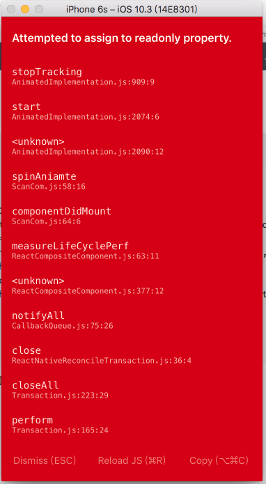
react-native動畫的坑
準備做一個循環上下滾動的react-native動畫,但是遇到了坑.我在調試的過程中把Animated.Image改成了Image,然后忘了改過來: spinAniamte = ()=> { if (this.animateToValue >= carmaHeight){ this.animateToValue = 0; } else { this.animateToValue = c...
猜你喜歡
React 動畫效果
React 動畫效果 參考https://reactcommunity.org/react-transition-group/css-transition 使用react-transition-group 安裝:react-transition-group 在頁面引入 要給那個元素添加動畫,就給那個元素外面加上: in={} 這個值如果為true...


freemarker + ItextRender 根據模板生成PDF文件
1. 制作模板 2. 獲取模板,并將所獲取的數據加載生成html文件 2. 生成PDF文件 其中由兩個地方需要注意,都是關于獲取文件路徑的問題,由于項目部署的時候是打包成jar包形式,所以在開發過程中時直接安照傳統的獲取方法沒有一點文件,但是當打包后部署,總是出錯。于是參考網上文章,先將文件讀出來到項目的臨時目錄下,然后再按正常方式加載該臨時文件; 還有一個問題至今沒有解決,就是關于生成PDF文件...
電腦空間不夠了?教你一個小秒招快速清理 Docker 占用的磁盤空間!
Docker 很占用空間,每當我們運行容器、拉取鏡像、部署應用、構建自己的鏡像時,我們的磁盤空間會被大量占用。 如果你也被這個問題所困擾,咱們就一起看一下 Docker 是如何使用磁盤空間的,以及如何回收。 docker 占用的空間可以通過下面的命令查看: TYPE 列出了docker 使用磁盤的 4 種類型: Images:所有鏡像占用的空間,包括拉取下來的鏡像,和本地構建的。 Con...

requests實現全自動PPT模板
http://www.1ppt.com/moban/ 可以免費的下載PPT模板,當然如果要人工一個個下,還是挺麻煩的,我們可以利用requests輕松下載 訪問這個主頁,我們可以看到下面的樣式 點每一個PPT模板的圖片,我們可以進入到詳細的信息頁面,翻到下面,我們可以看到對應的下載地址 點擊這個下載的按鈕,我們便可以下載對應的PPT壓縮包 那我們就開始做吧 首先,查看網頁的源代碼,我們可以看到每一...