amp實現輪播
1.最簡單的形式

<!doctype html>
<html lang="en">
<head>
	<meta charset="UTF-8">
	<title>Document</title>
	<script async src="https://cdn.ampproject.org/v0.js"></script>
	<script async custom-element="amp-carousel" src="https://cdn.ampproject.org/v0/amp-carousel-0.1.js"></script>
	<link rel="canonical" href="https://ampbyexample.com/introduction/hello_world/">
	<meta name="viewport" content="width=device-width,minimum-scale=1,initial-scale=1">
</head>
<body>
	<amp-carousel width="1920" height="898" layout="responsive" type="slides">
	    <amp-img src="./img/banner1.jpg" width="1920" height="898" alt=""></amp-img>
	    <amp-img src="./img/banner2.jpg" width="1920" height="898" alt=""></amp-img>
	</amp-carousel>
</body>
</html>
2.復雜輪播


<!doctype html>
<html >
<head>
<meta charset="utf-8">
<title>Image Galleries with amp-carousel</title>
<script async src="https://cdn.ampproject.org/v0.js"></script>
<!-- ## Setup -->
<!-- Import the carousel component in the header. -->
<script async custom-element="amp-carousel" src="https://cdn.ampproject.org/v0/amp-carousel-0.1.js"></script>
<!-- We will also be using the amp-fit-text component. -->
<script async custom-element="amp-fit-text" src="https://cdn.ampproject.org/v0/amp-fit-text-0.1.js"></script>
<!-- We will also be using the amp-selector component. -->
<script async custom-element="amp-selector" src="https://cdn.ampproject.org/v0/amp-selector-0.1.js"></script>
<!-- We will also be using the amp-bind component. -->
<script async custom-element="amp-bind" src="https://cdn.ampproject.org/v0/amp-bind-0.1.js"></script>
<!-- We will also be using the amp-lightbox-gallery component. -->
<script async custom-element="amp-lightbox-gallery" src="https://cdn.ampproject.org/v0/amp-lightbox-gallery-0.1.js"></script>
<link rel="canonical" href="https://ampbyexample.com/advanced/image_galleries_with_amp-carousel/">
<meta name="viewport" content="width=device-width,minimum-scale=1,initial-scale=1">
<style amp-boilerplate>body{-webkit-animation:-amp-start 8s steps(1,end) 0s 1 normal both;-moz-animation:-amp-start 8s steps(1,end) 0s 1 normal both;-ms-animation:-amp-start 8s steps(1,end) 0s 1 normal both;animation:-amp-start 8s steps(1,end) 0s 1 normal both}@-webkit-keyframes -amp-start{from{visibility:hidden}to{visibility:visible}}@-moz-keyframes -amp-start{from{visibility:hidden}to{visibility:visible}}@-ms-keyframes -amp-start{from{visibility:hidden}to{visibility:visible}}@-o-keyframes -amp-start{from{visibility:hidden}to{visibility:visible}}@keyframes -amp-start{from{visibility:hidden}to{visibility:visible}}</style><noscript><style amp-boilerplate>body{-webkit-animation:none;-moz-animation:none;-ms-animation:none;animation:none}</style></noscript>
<style amp-custom>
#carousel-with-preview amp-img {
transition: opacity 1s ease-in-out;
}
.carousel-preview {
display: flex;
align-items: center;
justify-content: center;
}
.carousel-preview button {
height: 40px;
width: 60px;
min-width: 60px;
margin: 4px;
padding: 0;
}
.carousel-preview .amp-carousel-slide {
margin: 4px;
padding: 0;
}
.carousel-preview button:active {
opacity: 0.5;
}
.carousel1, .carousel2 {
background: #eee;
margin: 16px 0;
}
.carousel1 .slide > amp-img > img{
object-fit: contain;
}
.carousel2 .slide > amp-img > img{
object-fit: contain;
}
.carousel2 .caption {
position: absolute;
bottom: 0;
left: 0;
right: 0;
padding: 8px;
background: rgba(0, 0, 0, 0.6);
color: #ddd;
font-size: smaller;
max-height: 30%;
}
.selected {
border-width: 1px;
border-style: solid;
}
/* define some contants */
.collapsible-captions {
--caption-height: 32px;
--image-height: 300px;
--caption-padding: 1rem;
--button-size: 28px;
--caption-color: #f5f5f5;;
--caption-bg-color: #111;
background: var(--caption-bg-color);
}
.collapsible-captions * {
/* disable chrome touch highlight */
-webkit-tap-highlight-color: rgba(255, 255, 255, 0);
box-sizing: border-box;
}
/* see https://ampbyexample.com/advanced/how_to_support_images_with_unknown_dimensions/ */
.collapsible-captions .fixed-height-container {
position: relative;
width: 100%;
height: var(--image-height);
}
.collapsible-captions amp-img img {
object-fit: contain;
}
.collapsible-captions figure {
margin: 0;
padding: 0;
}
/* single line caption */
.collapsible-captions figcaption {
position: absolute;
bottom: 0;
margin: 0;
width: 100%;
/* inital height is one line */
max-height: var(--caption-height);
line-height: var(--caption-height);
padding: 0 var(--button-size);
/* cut text after first line and show an ellipsis */
white-space: nowrap;
overflow: hidden;
text-overflow: ellipsis;
/* animate expansion */
transition: max-height 200ms cubic-bezier(0.4, 0, 0.2, 1);
/* overlay the carousel icons */
z-index: 1000;
/* some styling */
color: var(--caption-color);
background: var(--caption-bg-color);
}
/* expanded caption */
.collapsible-captions figcaption.expanded {
/* add padding and show all of the text */
padding: var(--button-size);
line-height: inherit;
white-space: normal;
text-overflow: auto;
max-height: calc(var(--caption-height) + var(--image-height));
/* show scrollbar in case caption is larger than image */
overflow: auto;
}
/* don't show focus highlights in chrome */
.collapsible-captions figcaption:focus {
outline: none;
border: none;
}
/* the expand/collapse icon */
.collapsible-captions figcaption span {
display: block;
position: absolute;
top: calc((var(--caption-height) - var(--button-size)) / 2);
right: 2px;
width: var(--button-size);
height: var(--button-size);
line-height: var(--button-size);
text-align: center;
font-size: 12px;
color: inherit;
cursor: pointer;
}
.amptext{
position: absolute;
width: 446px;
top: 42%;
height: 132px;
left: 4%;
}/*這段代碼如果不添加的話,文字會被圖片擠到下面去*/
</style>
</head>
<body>
<!-- ## Dynamic Text Size -->
<!--
The first image gallery uses
[amp-fit-text](https://www.ampproject.org/docs/reference/extended/amp-fit-text.html) to fit the text to the available space. This works well if captions vary not too much in length.
-->
<amp-carousel class="carousel1" layout="responsive" height="898" width="1920" type="slides">
<div class="slide">
<amp-img src="./img/banner1.jpg" layout="responsive" width="1920" height="898" alt=""></amp-img>
<amp-fit-text class="amptext" layout="responsive"> The Border Collie is a working and herding dog breed developed in the Anglo-Scottish border region for herding livestock, especially sheep. It was specifically bred for intelligence and obedience. Considered highly intelligent, and typically extremely energetic, acrobatic, smart and athletic, they frequently compete with great success in dog sports, in addition to their success in sheepdog trials. They are often cited as the most intelligent of all domestic dogs. Border Collies also remain employed throughout the world in their traditional work of herding livestock. </amp-fit-text>
</div>
<div class="slide">
<amp-img src="./img/banner2.jpg" layout="responsive" width="1920" height="898" alt=""></amp-img>
<amp-fit-text class="amptext" layout="responsive"> The Shetland Sheepdog, often known as the Sheltie, is a breed of herding dog. Less favored nicknames are the Toy Collie and the Miniature Collie. They are small dogs, and come in a variety of colors, such as sable, tri-color, and blue merle. They are very intelligent, vocal, excitable, energetic dogs who are always willing to please and work hard.
</amp-fit-text>
</div>
</amp-carousel>
<!-- ## Text Overlay -->
<!-- Another carousel with caption, this time the caption overlays the image. -->
<amp-carousel class="carousel2" layout="responsive" height="400" width="500" type="slides">
<div class="slide">
<amp-img src="./img/banner1.jpg" layout="fill" alt="Border Collie"></amp-img>
<div class="caption">
The Border Collie is a working and herding dog breed developed in the Anglo-Scottish border region
for herding livestock, especially sheep. It was specifically bred for intelligence and obedience.
</div>
</div>
<div class="slide">
<amp-img src="./img/banner2.jpg" layout="fill" alt="Shetland Sheepdog"></amp-img>
<div class="caption">
The Shetland Sheepdog, often known as the Sheltie, is a breed of herding dog. Less favored nicknames
are the Toy Collie and the Miniature Collie. They are small dogs, and come in a variety of colors,
such as sable, tri-color, and blue merle. They are very intelligent, vocal, excitable, energetic dogs
who are always willing to please and work hard.
</div>
</div>
</div>
</amp-carousel>
<!-- ## Linking Carousels with amp-bind -->
<!--
With [amp-bind](https://github.com/ampproject/amphtml/blob/master/extensions/amp-bind/amp-bind.md) it's possible to link carousel state across multiple amp-carousels.
Whenever the carousel slide changes, it updates `selectedSlide`. This causes the `text`
attribute in the `<p>` tag above the carousel to update as well.
Only [whitelisted functions](https://www.ampproject.org/es/docs/reference/components/amp-bind)
are allowed when using `amp-bind`. We use the unary plus operator before `selectedSlide` to cast it into an integer.
-->
<div>
<p class="m1"> Selected slide: <span [text]="+selectedSlide + 1">1</span>/3</p>
<amp-carousel controls type="slides" width="400" height="300" layout="responsive" [slide]="selectedSlide" on="slideChange:AMP.setState({selectedSlide:event.index})">
<amp-img src="./img/banner1.jpg" width="400" height="300"></amp-img>
<amp-img src="./img/banner2.jpg" width="400" height="300"></amp-img>
</amp-carousel>
</div>
<!--
This and the following carousel are linked to each other and to the large carousel above. Notice how
selecting an image on either of these two carousels changes the image on the top carousel.
In the first example, the CSS class for the selected image on the carousel is
set by bind when `selectedSlide` changes.
-->
<amp-carousel controls width="400" height="100">
<amp-img src="./img/banner1.jpg" width="100" height="75" role="button" tabindex="0" [class]="selectedSlide == 0 ? 'selected' : ''" on="tap:AMP.setState({selectedSlide: 0})"></amp-img>
<amp-img src="./img/banner2.jpg" width="100" height="75" role="button" tabindex="1" [class]="selectedSlide == 1 ? 'selected' : ''" on="tap:AMP.setState({selectedSlide: 1})"></amp-img>
</amp-carousel>
<!--
In the second example, an [amp-selector](https://github.com/ampproject/amphtml/blob/master/extensions/amp-selector/amp-selector.md) eliminates redundant code, but functions in the same way as the carousel above.
-->
<amp-selector layout="container" name="carousel-selector" [selected]="selectedSlide" on="select:AMP.setState({selectedSlide: event.targetOption})">
<amp-carousel controls width="400" height="100">
<amp-img src="./img/banner1.jpg" width="100" height="75" option="0"></amp-img>
<amp-img src="./img/banner2.jpg" width="100" height="75" option="1"></amp-img>
</amp-carousel>
</amp-selector>
<!-- ## Collapsible Image Captions with amp-bind
Here is another workaround for image captions: expandable captions. The idea is to first show only the first line of a caption (using `text-overflow: ellipsis;`). When the user clicks on the caption, the caption is expanded to show the full text. This works by using `amp-bind` to toggle a CSS class `expanded` when the caption is clicked.
This sample uses the trick described [here](/advanced/how_to_support_images_with_unknown_dimensions/) to ensure that images never overlap the caption. A positive side-effect is that image dimensions don't need to be known in advance either. This makes it a very flexible approach for an image carousel with images and captions of unknown size/length.
-->
<amp-carousel class="collapsible-captions" height="332" layout="fixed-height" type="slides">
<figure>
<div class="fixed-height-container">
<amp-img layout="fill" src="https://unsplash.it/500/400"></amp-img>
</div>
<figcaption on="tap:AMP.setState({expanded: !expanded})" tabindex="0" role="button" [class]="expanded ? 'expanded' : ''">Lorem ipsum dolor sit amet, consectetuer adipiscing elit. Aenean commodo ligula eget dolor. Aenean massa. Cum sociis natoque penatibus et magnis dis parturient montes, nascetur ridiculus mus. Donec quam felis, ultricies nec, pellentesque eu, pretium quis, sem. Nulla consequat massa quis enim. Donec pede justo, fringilla vel, aliquet nec, vulputate eget, arcu.
<span [text]="expanded ? '▼' : '▲'">▲</span>
</figcaption>
</figure>
<figure>
<div class="fixed-height-container">
<amp-img layout="fill" src="https://unsplash.it/500/500"></amp-img>
</div>
<figcaption on="tap:AMP.setState({expanded: !expanded})" tabindex="0" role="button" [class]="expanded ? 'expanded' : ''">Lorem ipsum dolor sit amet, consectetuer adipiscing elit. Nulla consequat massa quis enim. Donec pede justo, fringilla vel, aliquet nec, vulputate eget, arcu.
<span [text]="expanded ? '▼' : '▲'">▲</span></figcaption>
</figure>
<figure>
<div class="fixed-height-container">
<amp-img layout="fill" src="https://unsplash.it/200/500"></amp-img>
</div>
<figcaption on="tap:AMP.setState({expanded: !expanded})" tabindex="0" role="button" [class]="expanded ? 'expanded' : ''">Lorem ipsum dolor sit amet, consectetuer adipiscing elit. Aenean commodo ligula eget dolor. Aenean massa. Cum sociis natoque penatibus et magnis dis parturient montes, nascetur ridiculus mus. Donec quam felis, ultricies nec, pellentesque eu, pretium quis, sem. Lorem ipsum dolor sit amet, consectetuer adipiscing elit. Aenean commodo ligula eget dolor. Aenean massa. Cum sociis natoque penatibus et magnis dis parturient montes, nascetur ridiculus mus. Donec quam felis, ultricies nec, pellentesque eu, pretium quis, sem. Nulla consequat massa quis enim. Donec pede justo, fringilla vel, aliquet nec, vulputate eget, arcu.
<span [text]="expanded ? '▼' : '▲'">▲</span></figcaption>
</figure>
</amp-carousel>
<!-- ## Image Galleries with Previews -->
<!-- You can reveal specific slides in carousel using an on tap action `on="tap:my-carousel.goToSlide(index=0)"`. Slides are identified by the carousel id and index (starting at 0).
-->
<div>
<amp-carousel id="carousel-with-preview" width="400" height="300" layout="responsive" type="slides">
<amp-img src="https://unsplash.it/400/300?image=10" width="400" height="300" layout="responsive" alt="a sample image"></amp-img>
<amp-img src="https://unsplash.it/400/300?image=11" width="400" height="300" layout="responsive" alt="a sample image"></amp-img>
<amp-img src="https://unsplash.it/400/300?image=12" width="400" height="300" layout="responsive" alt="a sample image"></amp-img>
<amp-img src="https://unsplash.it/400/300?image=13" width="400" height="300" layout="responsive" alt="a sample image"></amp-img>
</amp-carousel>
<div class="carousel-preview">
<button on="tap:carousel-with-preview.goToSlide(index=0)"><amp-img src="https://unsplash.it/60/40?image=10" width="60" height="40" layout="responsive" alt="a sample image"></amp-img></button>
<button on="tap:carousel-with-preview.goToSlide(index=1)"><amp-img src="https://unsplash.it/60/40?image=11" width="60" height="40" layout="responsive" alt="a sample image"></amp-img></button>
<button on="tap:carousel-with-preview.goToSlide(index=2)"><amp-img src="https://unsplash.it/60/40?image=12" width="60" height="40" layout="responsive" alt="a sample image"></amp-img></button>
<button on="tap:carousel-with-preview.goToSlide(index=3)"><amp-img src="https://unsplash.it/60/40?image=13" width="60" height="40" layout="responsive" alt="a sample image"></amp-img></button>
</div>
</div>
<!-- You can even use a second carousel for the preview if a carousel contains a large number of images (make sure to use the `type=carousel` for the second one). -->
<div>
<amp-carousel id="carousel-with-carousel-preview" width="400" height="300" layout="responsive" type="slides">
<amp-img src="https://unsplash.it/400/300?image=10" width="400" height="300" layout="responsive" alt="a sample image"></amp-img>
<amp-img src="https://unsplash.it/400/300?image=11" width="400" height="300" layout="responsive" alt="a sample image"></amp-img>
<amp-img src="https://unsplash.it/400/300?image=12" width="400" height="300" layout="responsive" alt="a sample image"></amp-img>
<amp-img src="https://unsplash.it/400/300?image=13" width="400" height="300" layout="responsive" alt="a sample image"></amp-img>
<amp-img src="https://unsplash.it/400/300?image=14" width="400" height="300" layout="responsive" alt="a sample image"></amp-img>
<amp-img src="https://unsplash.it/400/300?image=15" width="400" height="300" layout="responsive" alt="a sample image"></amp-img>
<amp-img src="https://unsplash.it/400/300?image=16" width="400" height="300" layout="responsive" alt="a sample image"></amp-img>
<amp-img src="https://unsplash.it/400/300?image=17" width="400" height="300" layout="responsive" alt="a sample image"></amp-img>
<amp-img src="https://unsplash.it/400/300?image=18" width="400" height="300" layout="responsive" alt="a sample image"></amp-img>
<amp-img src="https://unsplash.it/400/300?image=19" width="400" height="300" layout="responsive" alt="a sample image"></amp-img>
<amp-img src="https://unsplash.it/400/300?image=110" width="400" height="300" layout="responsive" alt="a sample image"></amp-img>
<amp-img src="https://unsplash.it/400/300?image=111" width="400" height="300" layout="responsive" alt="a sample image"></amp-img>
<amp-img src="https://unsplash.it/400/300?image=112" width="400" height="300" layout="responsive" alt="a sample image"></amp-img>
<amp-img src="https://unsplash.it/400/300?image=113" width="400" height="300" layout="responsive" alt="a sample image"></amp-img>
<amp-img src="https://unsplash.it/400/300?image=114" width="400" height="300" layout="responsive" alt="a sample image"></amp-img>
<amp-img src="https://unsplash.it/400/300?image=115" width="400" height="300" layout="responsive" alt="a sample image"></amp-img>
<amp-img src="https://unsplash.it/400/300?image=116" width="400" height="300" layout="responsive" alt="a sample image"></amp-img>
<amp-img src="https://unsplash.it/400/300?image=117" width="400" height="300" layout="responsive" alt="a sample image"></amp-img>
</amp-carousel>
<amp-carousel class="carousel-preview" width="auto" height="48" layout="fixed-height" type="carousel">
<button on="tap:carousel-with-carousel-preview.goToSlide(index=0)"><amp-img src="https://unsplash.it/60/40?image=10" width="60" height="40" layout="responsive" alt="a sample image"></amp-img></button>
<button on="tap:carousel-with-carousel-preview.goToSlide(index=1)"><amp-img src="https://unsplash.it/60/40?image=11" width="60" height="40" layout="responsive" alt="a sample image"></amp-img></button>
<button on="tap:carousel-with-carousel-preview.goToSlide(index=2)"><amp-img src="https://unsplash.it/60/40?image=12" width="60" height="40" layout="responsive" alt="a sample image"></amp-img></button>
<button on="tap:carousel-with-carousel-preview.goToSlide(index=3)"><amp-img src="https://unsplash.it/60/40?image=13" width="60" height="40" layout="responsive" alt="a sample image"></amp-img></button>
<button on="tap:carousel-with-carousel-preview.goToSlide(index=4)"><amp-img src="https://unsplash.it/60/40?image=14" width="60" height="40" layout="responsive" alt="a sample image"></amp-img></button>
<button on="tap:carousel-with-carousel-preview.goToSlide(index=5)"><amp-img src="https://unsplash.it/60/40?image=15" width="60" height="40" layout="responsive" alt="a sample image"></amp-img></button>
<button on="tap:carousel-with-carousel-preview.goToSlide(index=6)"><amp-img src="https://unsplash.it/60/40?image=16" width="60" height="40" layout="responsive" alt="a sample image"></amp-img></button>
<button on="tap:carousel-with-carousel-preview.goToSlide(index=7)"><amp-img src="https://unsplash.it/60/40?image=17" width="60" height="40" layout="responsive" alt="a sample image"></amp-img></button>
<button on="tap:carousel-with-carousel-preview.goToSlide(index=8)"><amp-img src="https://unsplash.it/60/40?image=18" width="60" height="40" layout="responsive" alt="a sample image"></amp-img></button>
<button on="tap:carousel-with-carousel-preview.goToSlide(index=9)"><amp-img src="https://unsplash.it/60/40?image=19" width="60" height="40" layout="responsive" alt="a sample image"></amp-img></button>
<button on="tap:carousel-with-carousel-preview.goToSlide(index=10)"><amp-img src="https://unsplash.it/60/40?image=110" width="60" height="40" layout="responsive" alt="a sample image"></amp-img></button>
<button on="tap:carousel-with-carousel-preview.goToSlide(index=11)"><amp-img src="https://unsplash.it/60/40?image=111" width="60" height="40" layout="responsive" alt="a sample image"></amp-img></button>
<button on="tap:carousel-with-carousel-preview.goToSlide(index=12)"><amp-img src="https://unsplash.it/60/40?image=112" width="60" height="40" layout="responsive" alt="a sample image"></amp-img></button>
<button on="tap:carousel-with-carousel-preview.goToSlide(index=13)"><amp-img src="https://unsplash.it/60/40?image=113" width="60" height="40" layout="responsive" alt="a sample image"></amp-img></button>
<button on="tap:carousel-with-carousel-preview.goToSlide(index=14)"><amp-img src="https://unsplash.it/60/40?image=114" width="60" height="40" layout="responsive" alt="a sample image"></amp-img></button>
<button on="tap:carousel-with-carousel-preview.goToSlide(index=15)"><amp-img src="https://unsplash.it/60/40?image=115" width="60" height="40" layout="responsive" alt="a sample image"></amp-img></button>
<button on="tap:carousel-with-carousel-preview.goToSlide(index=16)"><amp-img src="https://unsplash.it/60/40?image=116" width="60" height="40" layout="responsive" alt="a sample image"></amp-img></button>
<button on="tap:carousel-with-carousel-preview.goToSlide(index=17)"><amp-img src="https://unsplash.it/60/40?image=117" width="60" height="40" layout="responsive" alt="a sample image"></amp-img></button>
</amp-carousel>
</div>
<!-- ## Image Galleries with Lightbox -->
<!-- You can link an image gallery to a lightbox using [amp-lightbox-gallery](https://www.ampproject.org/docs/reference/components/amp-lightbox-gallery) so that:
- when user taps on image N, he enters a lightbox mode
- user can swipe inside of lightbox mode between images
- when user exits the lighbox mode, the carousel points to the last image seen on the lightbox
-->
<div>
<amp-carousel id="carousel-with-lightbox" width="400" height="300" layout="responsive" type="slides" lightbox>
<amp-img src="https://unsplash.it/400/300?image=10" width="400" height="300" layout="responsive" alt="a sample image"></amp-img>
<amp-img src="https://unsplash.it/400/300?image=11" width="400" height="300" layout="responsive" alt="a sample image"></amp-img>
<amp-img src="https://unsplash.it/400/300?image=12" width="400" height="300" layout="responsive" alt="a sample image"></amp-img>
<amp-img src="https://unsplash.it/400/300?image=13" width="400" height="300" layout="responsive" alt="a sample image"></amp-img>
</amp-carousel>
</div>
</body>
</html>
智能推薦
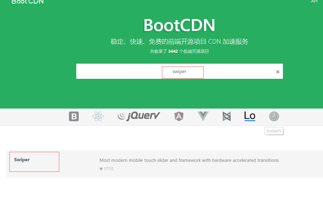
swiper實現輪播圖
1、swiper輪播圖 swiper中文網 https://www.swiper.com.cn/ bootcdn https://www.bootcdn.cn/ 2、案例 代碼如下: 效果如下:...
如何實現輪播圖
如何實現輪播圖(轉載) 版權聲明:本文為CSDN博主「_Kattem」的原創文章,遵循 CC 4.0 BY-SA 版權協議,轉載請附上原文出處鏈接及本聲明。 原文鏈接:https://blog.csdn.net/weixin_42276859/article/details/80648944 1.介紹 輪播圖,顧名思義,輪流播放的廣告圖。它是由網頁banner進化而來,通常放在屏幕最顯眼的位置,以...

猜你喜歡

jQuery實現輪播圖
蠢蠢的前端自學小白 耗盡千辛萬苦終于做出來了輪播圖。。 . (不會做錄屏動態圖。。見諒啦) 功能:左右箭頭點擊切換、下方小圓點點擊切換、自動播放 代碼如下:(還有很多可更改優化的地方,請多多指正!) html部分: CSS部分 jQuery部分:...

vue實現輪播圖
使用vuejs實現輪播圖 一、原理 1.點擊左右按鈕切換圖片 首先,圖片src是動態變化的,需要使用v-bind動態綁定,縮寫為“:”。 然后,為左右按鈕點擊事件(click)添加事件監聽,v-on,縮寫為“@”。 再次,將點擊事件綁定方法(methods),通過index–和index++實現圖片下標的變化。 2.首頁和末頁按鈕的顯示問...
輪播圖的實現
博客簡介 本篇博客介紹用swiper組件來方便地實現小程序的輪播圖效果,同時結合slider滑動選擇器,switch組件來設計控件,對輪播圖的切換效果和速度進行控制: swiper組件介紹 實現輪播效果 slider滑動選擇器介紹 switch開關介紹 用slider和switch設計控件 GIF展示 swiper組件介紹 滑塊視圖容器。其中只可放置swiper-item組件,否則會導致未定義的行...
實現網站輪播圖片
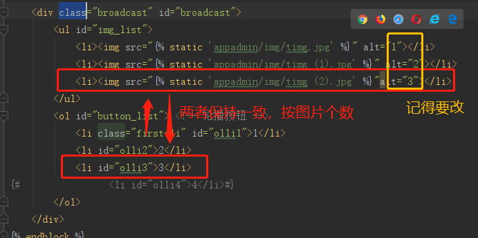
在做的Django項目首頁想添加個圖片輪播的效果,效果為:共3張圖片,圖片1s自動更換一次,圖片右下角有數字跳轉對應圖片。 以下代碼借鑒博客地址:https://blog.csdn.net/Zhangeq/article/details/84306332 根據自己的項目效果,略作修改。 實現步驟如下: 1.添加css文件,我命名為picShow.css 2.添加js文件,我命名為picShow.j...