SwiftUI 控件之Button 按鈕初級和高級實用(2020版教程)
SwiftUI 控件之Button 按鈕初級和高級實用(2020版教程)
Button是一個非常基本的UI控件,您可以在所有應用中找到該控件。如果您以前學習過iOS編程,則SwiftUI中的Button與UIKit中的UIButton非常相似。它更加靈活和可定制。本文將給您介紹一下幾個方面的內容:
- 如何創建一個簡單的按鈕并處理用戶的選擇
- 如何自定義按鈕的背景,填充和字體
- 如何在按鈕上添加邊框
- 如何同時創建帶有圖像和文本的按鈕
- 如何創建帶有漸變背景和陰影的按鈕
- 如何創建全角按鈕
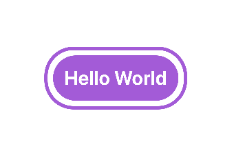
代碼
import SwiftUI

struct ContentView: View {
    var body: some View {
        Button(action:{
            print("touch")
        }){

            Text("Hello World")
                .fontWeight(.bold)
                .font(.title)
                .padding()
                .background(Color.purple)
                .cornerRadius(40)
                .foregroundColor(.white)
                .padding(10)
                .overlay(
                    RoundedRectangle(cornerRadius: 40)
                        .stroke(Color.purple, lineWidth: 5)
            )

        }
    }
}
效果
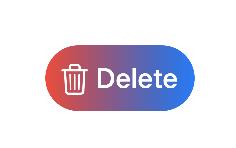
設置圖片按鈕
Button(action: {
    print("Delete tapped!")
}) {
    HStack {
        Image(systemName: "trash")
            .font(.title)
        Text("Delete")
            .fontWeight(.semibold)
            .font(.title)
    }
    .padding()
    .foregroundColor(.white)
    .background(Color.red)
    .cornerRadius(40)
}
效果

設置漸變效果
import SwiftUI

struct ContentView: View {
    var body: some View {
      Button(action: {
          print("Delete tapped!")
      }) {
          HStack {
              Image(systemName: "trash")
                  .font(.title)
              Text("Delete")
                  .fontWeight(.semibold)
                  .font(.title)
          }
          .padding()
          .foregroundColor(.white)
          //.background(Color.red)
            .background(LinearGradient(gradient: Gradient(colors: [Color.red, Color.blue]), startPoint: .leading, endPoint: .trailing))
          .cornerRadius(40)
      }
    }
}
SwiftUI 自定義顏色集
通過16進制設置顏色
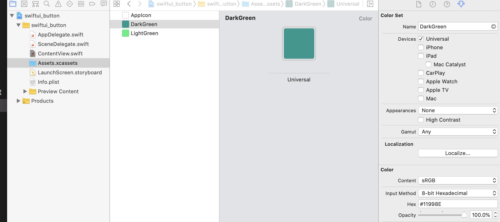
import SwiftUI

struct ContentView: View {
    var body: some View {
        Button(action: {
            print("Delete tapped!")
        }) {
            HStack {
                Image(systemName: "trash")
                    .font(.title)
                Text("Delete")
                    .fontWeight(.semibold)
                    .font(.title)
            }
            .padding()
            .foregroundColor(.white)
                //.background(Color.red)
                .background(LinearGradient(gradient: Gradient(colors: [Color("DarkGreen"), Color("LightGreen")]), startPoint: .leading, endPoint: .trailing))
                .cornerRadius(40)
        }
    }
}
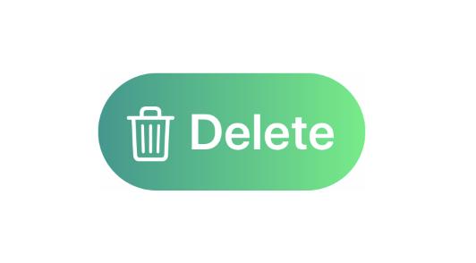
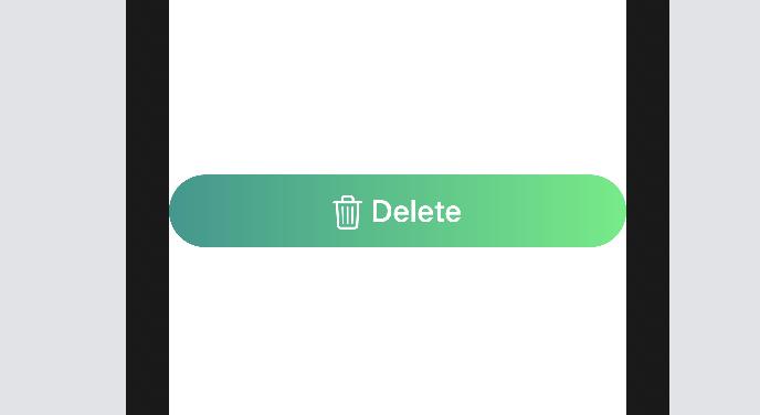
SwiftUI 設置控件鋪滿整個屏幕
import SwiftUI

struct ContentView: View {
    var body: some View {
       Button(action: {
           print("Delete tapped!")
       }) {
           HStack {
               Image(systemName: "trash")
                   .font(.title)
               Text("Delete")
                   .fontWeight(.semibold)
                   .font(.title)
           }
           .frame(minWidth: 0, maxWidth: .infinity)
           .padding()
           .foregroundColor(.white)
           .background(LinearGradient(gradient: Gradient(colors: [Color("DarkGreen"), Color("LightGreen")]), startPoint: .leading, endPoint: .trailing))
           .cornerRadius(40)
       }
    }
}
參考文獻
更多SwiftUI教程和代碼關注專欄
- 請關注我的專欄 SwiftUI教程與源碼
智能推薦
SwiftUI NavigationLink內實現Button按鈕獨立響應事件(經典教程)
實戰需求 SwiftUI NavigationLink內實現Button按鈕獨立響應事件 本文價值與收獲 看完本文后,您將能夠作出下面的界面 看完本文您將掌握的技能 掌握NavigationLink基礎使用 設置NavigationLInk內部組件Button響應優先級 實現內置Button獨立響應事件 基礎知識 highPriorityGesture(_:including:) 以比視圖定義的手...
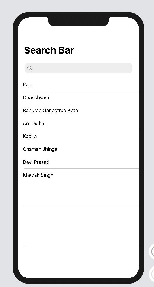
SwiftUI 基礎之05 list 和 searchbar (2020)
SwiftUI 基礎之05 list 和 searchbar (2020) 首要 searchbar 效果圖 image.png 參考資料 https://medium.com/better-programming/implement-searchbar-in-swiftui-556a204e1970...
SwiftUI 基礎之02 NavigationView和List(2020)
SwiftUI 基礎之NavigationView和List(2020) 效果 [email protected] 更多SwiftUI教程和代碼關注專欄 請關注我的專欄 SwiftUI教程與源碼...
SwiftUI macOS基礎控件之TextField
本文價值與收獲 看完本文后,您將能夠作出下面的界面 [email protected] 看完本文您將掌握的技能 掌握TextField基礎使用 代碼 技術交流 QQ:3365059189 SwiftUI技術交流QQ群:518696470 請關注我的專欄icloudend, SwiftUI教程與源碼 https://www.jianshu.com/c/7b3e3b671970...
猜你喜歡
SwiftUI 2.0 實戰之自定義導航欄添加圖標和按鈕(教程含源碼)
本文價值與收獲 看完本文后,您將能夠作出下面的界面 基礎知識 principal item放置在主要部分中。 主要item占據重要地位。 例如,網絡瀏覽器的位置字段將被視為主要項目。 實戰代碼 在iOS 14中,SwiftUI可以使用新的工具欄修改器來自定義導航欄標題視圖。 這與在UIKit中設置navigationItem.titleView相同。...
Windows Phone 7 控件重寫之Button 圖片按鈕
2019獨角獸企業重金招聘Python工程師標準>>> Windows Phone 自帶的Button樣式很優雅很大氣,而且和整體的風格也很一致。但是,個性化定制的界面有時候需要其他的“特殊”要求。比如圖片按鈕,由于個性化程度較高,直接套用現在的Button的樣式的話會導致UI風格不統一,但是我們又不想用其他比如“Image”來代替...
SwiftUI 如何取消NavigationLink中Button的默認效果和點擊高亮效果(教程含代碼)
實戰需求 NavigationLink 和Button組合使用時,使用時我們需要刪除Button的默認效果。另外希望點擊時不會出現Highlight的顯示。 本文價值與收獲 看完本文后,您將能夠作出下面的界面 Button 觸發時執行操作的控件。 使用教程 您可以通過提供操作和標簽來創建按鈕。操作是方法或閉包屬性,當用戶單擊或點擊按鈕時,該操作會執行某些操作。標簽是描述按鈕動作的視圖,例如通過顯示...
